︎︎︎
Experimenting
IDEA:
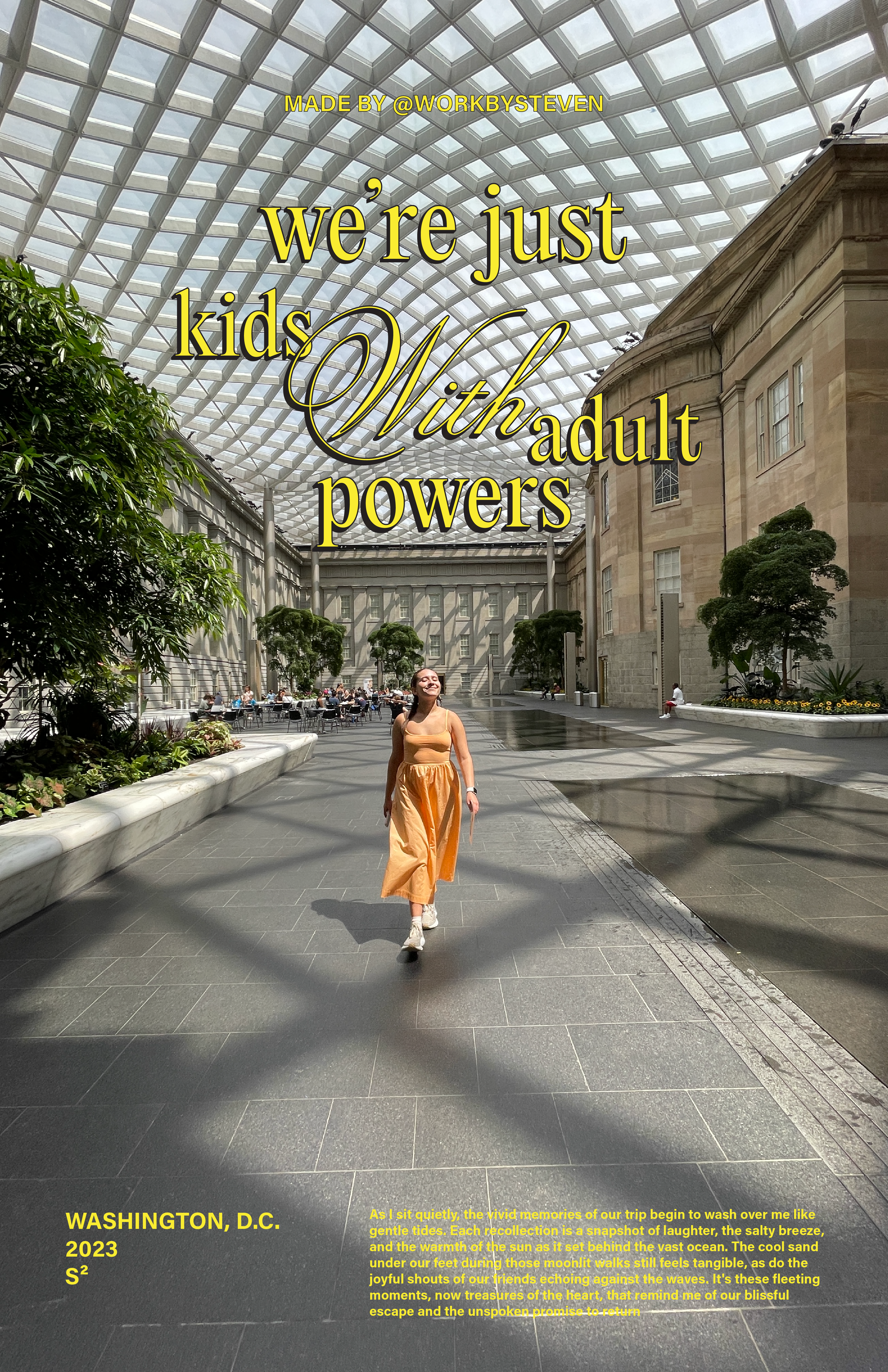
For this poster, I aimed to evoke the nostalgia of a vacation from days gone by.IDEA:
Inspired by a quote from Massimo Vignelli, I aimed to create a poster that honors an inspirational designer. Executed in a minimalist style, the design is eye-catching yet sufficiently subtle to avoid overwhelming the viewer.


IDEA:
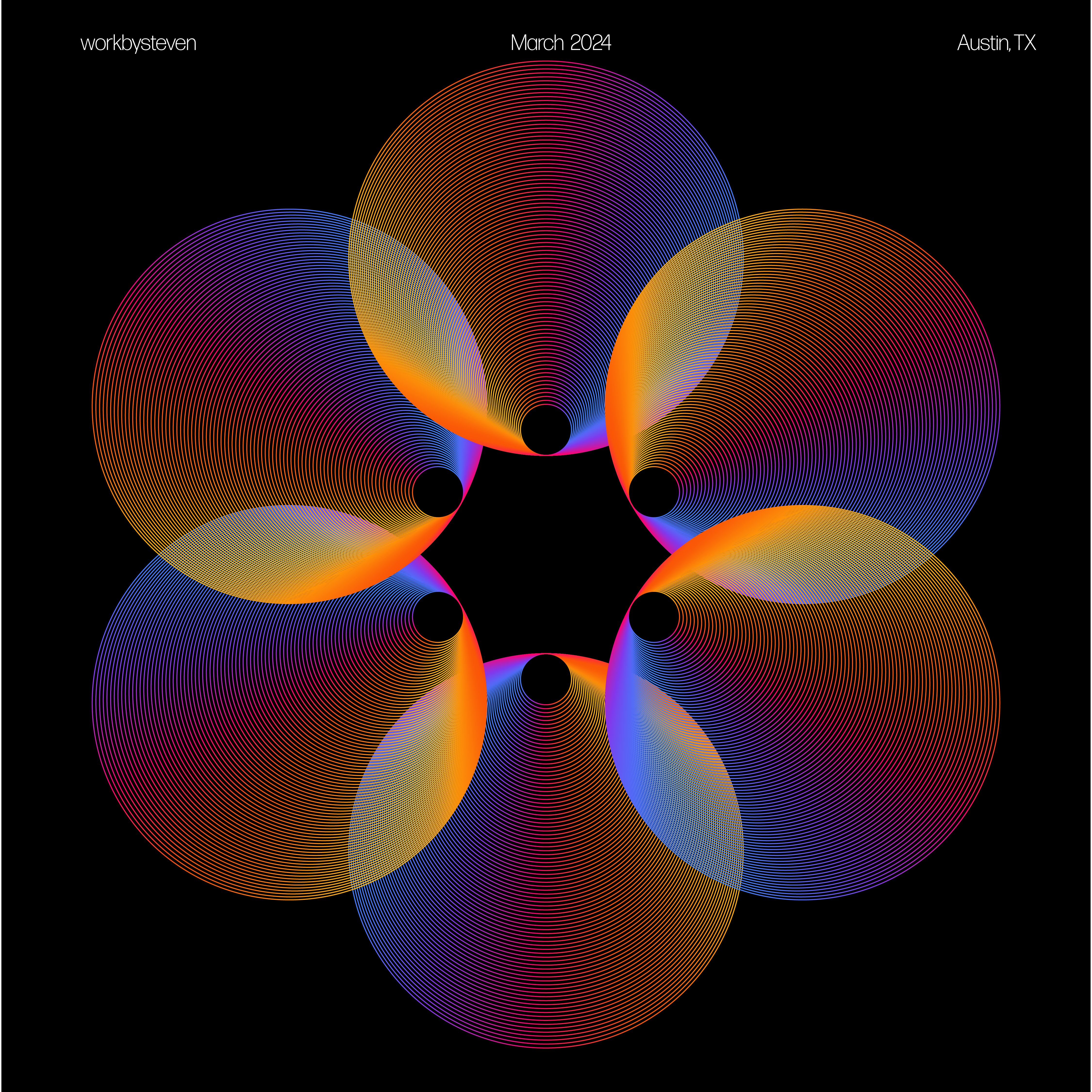
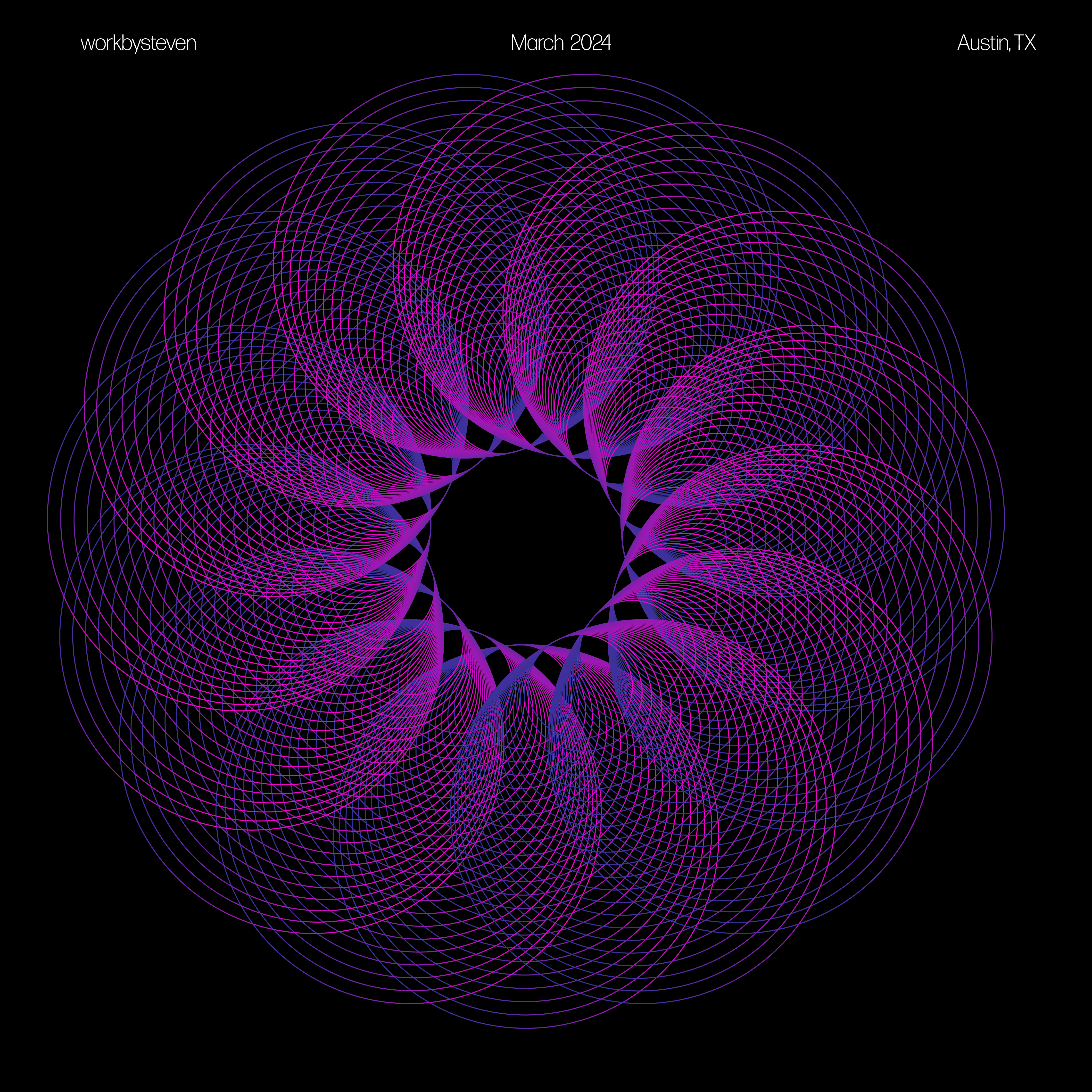
In this experiment, I delved into Illustrator's which are not part of my regular workflow. Additionally, I aimed to incorporate a more mathematical approach to design, focusing on creating symmetrical and visually appealing compositions. This approach allowed me to explore the intersection of precision and artistry, resulting in designs that are both aesthetically pleasing and structurally sound.


IDEA:
In this experiemnet, I worked with hierachy and typography to create an ironic politcal sign for ChatGPT. I created two versions of the most common political signs seen today: one clean and modern, and the other scholarly and timeless.
IDEA:
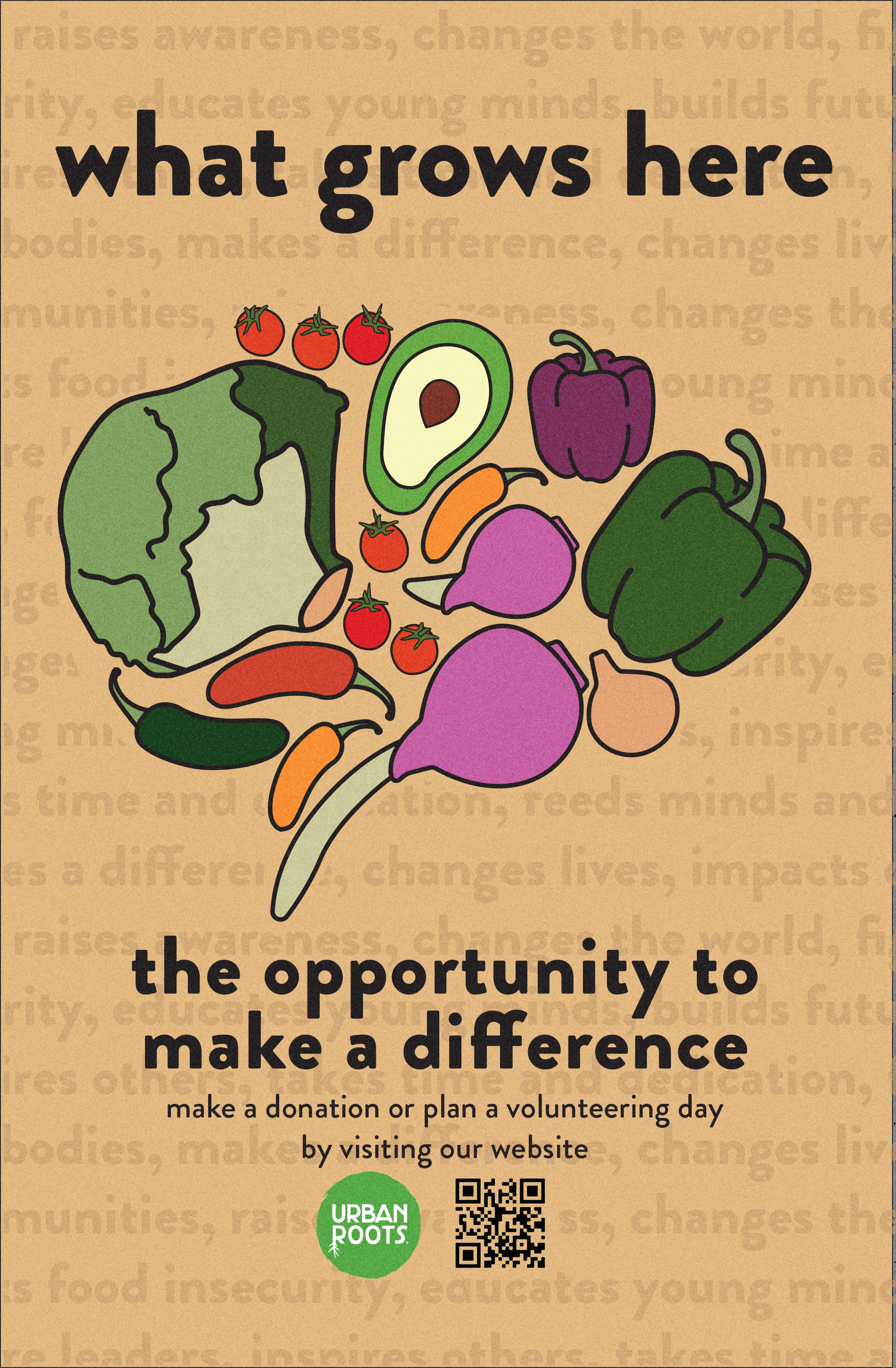
In this project, I collaborated with a team to create public relations materials for a local non-profit aimed at attracting new residents to Austin, Texas, particularly those in the technology sector. Our objective was to design a poster that was easily readable and engaging for a busy audience.The design features a simple, impactful headline leading into a compelling tagline: “What grows here? Opportunity to make a difference.” This is followed by a concise blurb encouraging viewers to learn more about volunteering, enhanced with a QR code for convenient access to additional information. The overall layout and typography were chosen to ensure clarity and immediacy, catering to individuals who are often on the go.

