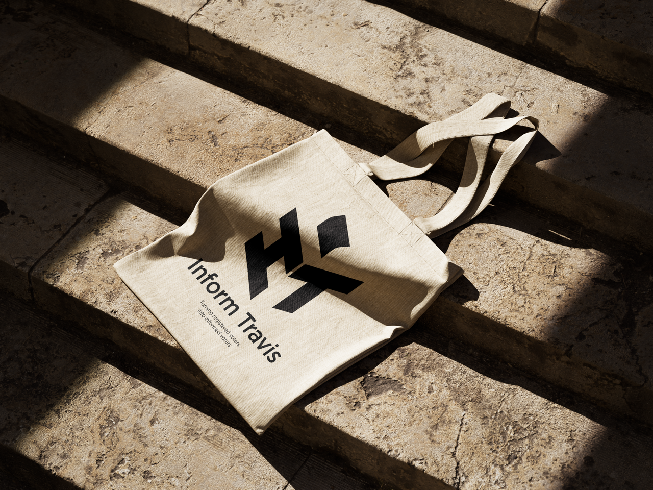
MERCHANDISE

POSTERS
Inform Travis Case Study
The Client:
I have had the privilege of working with Inform Travis, a social media project based at the University of Texas at Austin. The organization's primary aim is to educate registered voters in the county about propositions being voted on, while maintaining a non-partisan approach.Inform Travis focuses on leveraging social media platforms to reach a wide audience and provide them with unbiased information and resources. Their aim is to foster an informed electorate, empowering individuals to make educated decisions when it comes to participating in the democratic process.
As the graphic designer for Inform Travis, my role was to create the brand identity for the organization as well as visually engaging and informative content that conveyed the organization's messages effectively. I worked closely with the team to understand their vision and objectives, ensuring that each design piece aligned with their non-partisan values.
Working with Inform Travis was a rewarding experience, as I got to contribute to their mission of fostering civic engagement and informed decision-making among voters. It was inspiring to be part of a team that recognized the importance of non-partisan education in today's political climate.
The Client Expectations:
Since the project was starting from the ground up, I was given a healthy amount of creative freedom. With that being said there were a few asks from the client.These included:
- a design that would appeal to a younger audience, in the college age, so 18-24 years old
- a modern and simple look to match the style of posts they wanted to make
- make it non-partisan
- will last through time
The research
At the beginning of the research phase I wanted to conduct a small competition analysis of organizations who had a similar objective to Inform Travis. I began looking at organizations who were also non-partisan in the political sphere. These organizations included Move Texas, The Texas Tribune and Texas Freedom Network.

So at this point I am getting a grasp on what these organizations are doing. The formula was as follows: main logo or symbol paired with a sans serif modern typeface. I knew if I could replicate this in my design I would successfully nail all of the clients requests.
Now, I needed to think how I was going to execute the main logo. Initially, I thought using a serif font will give the appearance of a more scholarly organization. This was a more unorthodox approach but I went with it since I there was some freedom in the project. This was not working so I went back to the drawing board and decided to keep the same formula as the others.
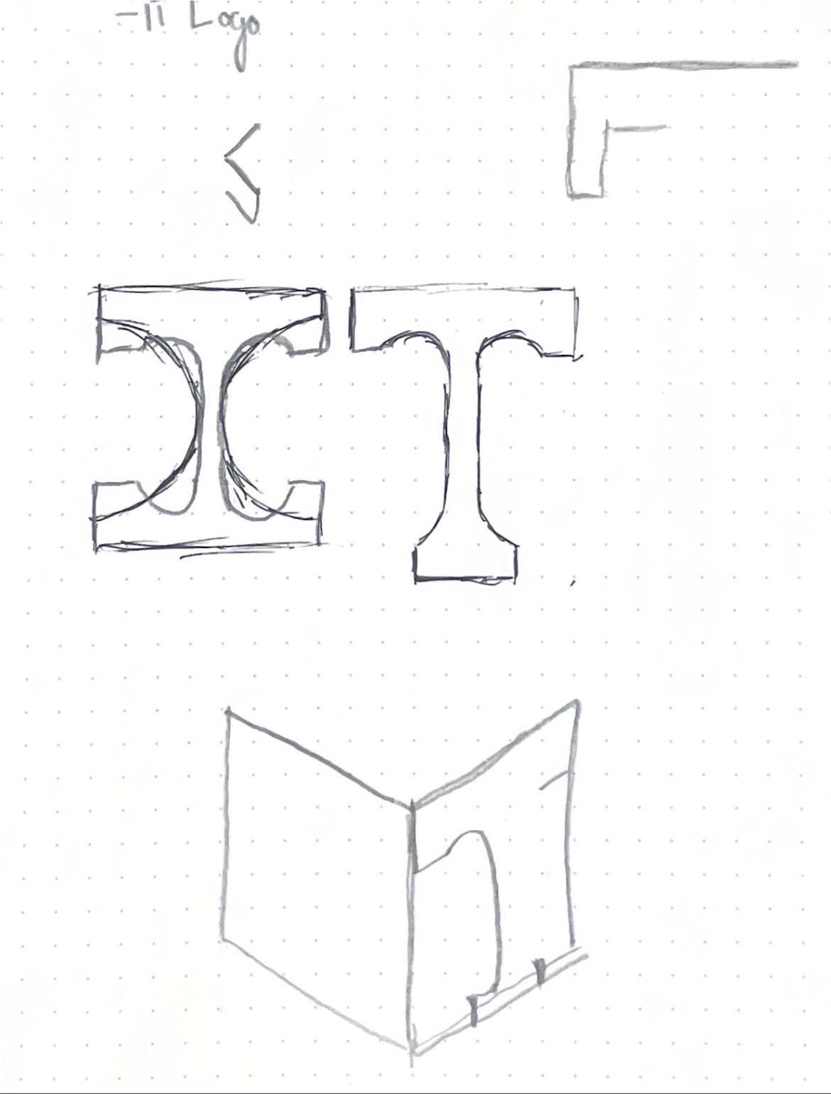
After some thinking, I decided that I should remain true the main point of the project, voting. I then thought of things that would come to mind when thinking of voting. There were a lot of things that came to mind but the one that stuck and remained non-partisan was an voter ballot box. You can see in the sketches, I made one final attempt at using a serif typeface and quickly ditched it for the san-serif.
On the left, are my attempts of adding color to the logo but none of them were successful at looking both simple and modern. Also, with the introduction of color meant that it looked like the two party colors were clashing and this is not something we wanted.

The Results:
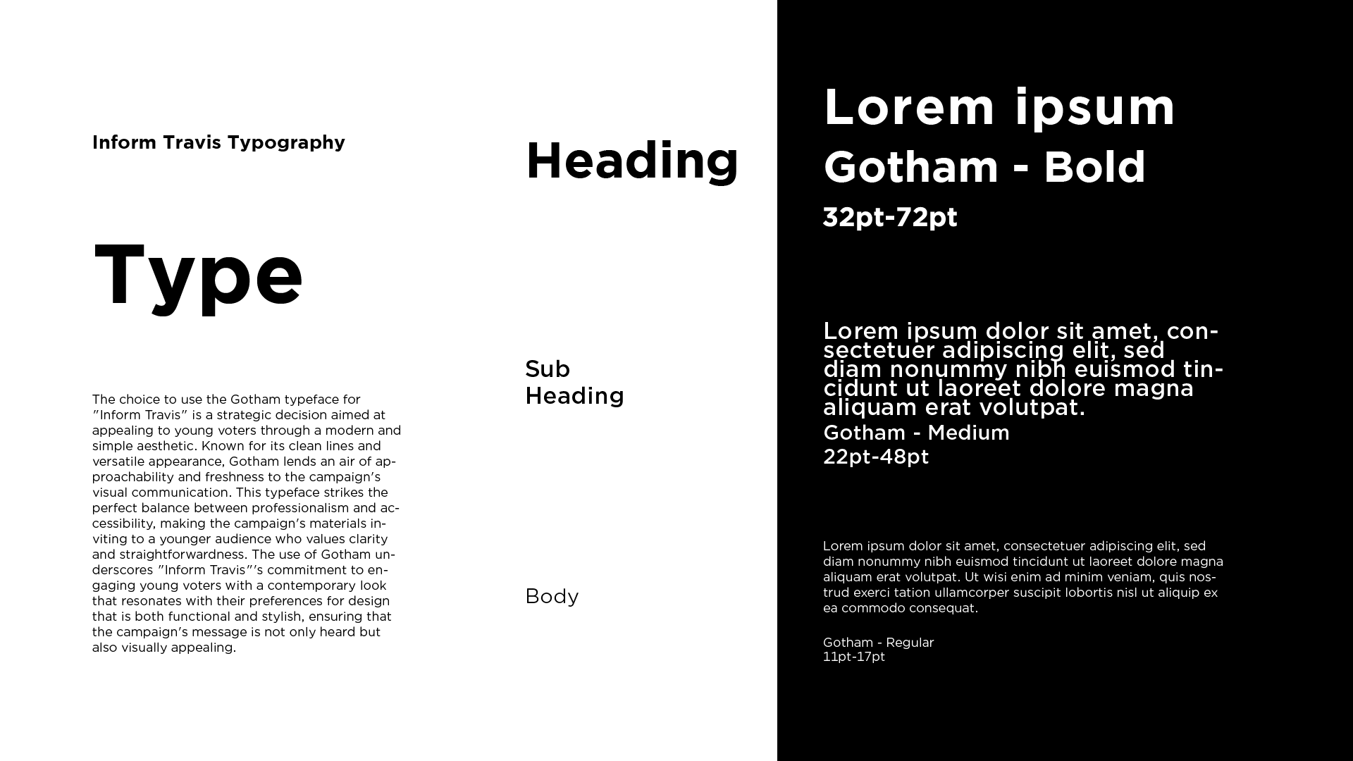
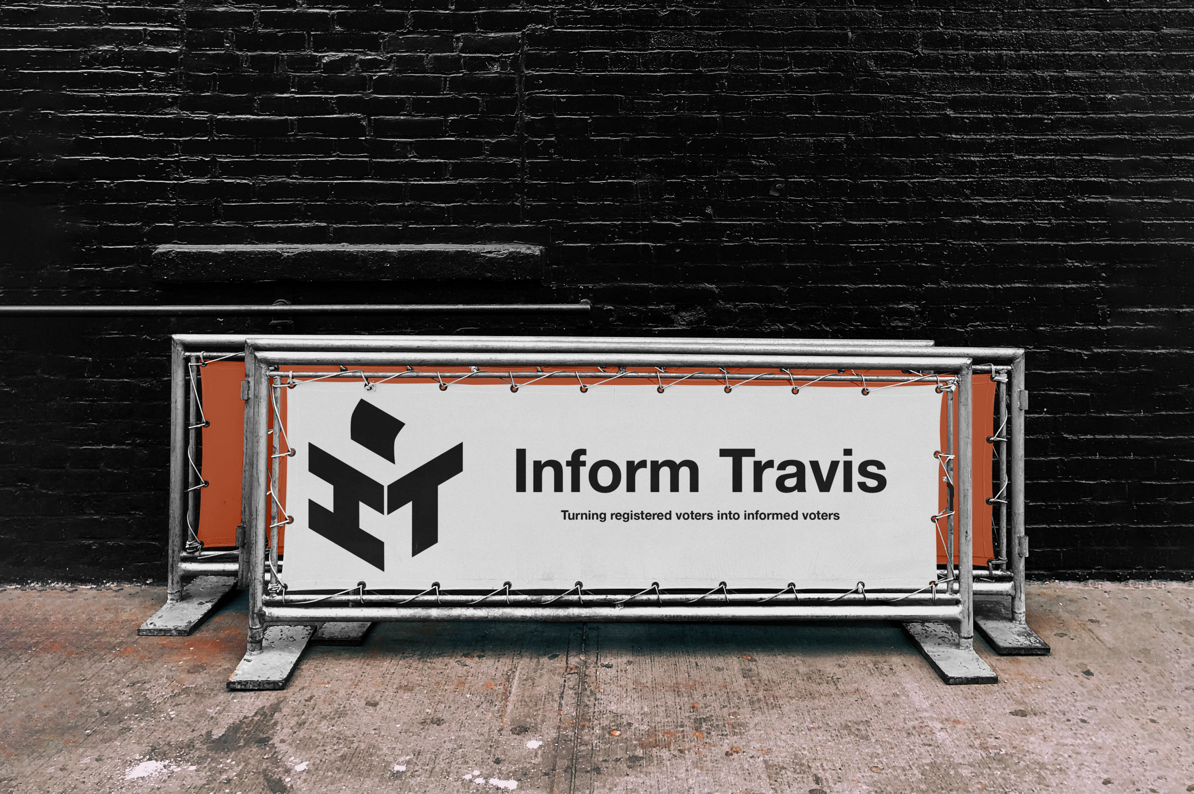
Finally, I had the main logo. To keep with the modern feel I went with the Gotham typeface. I knew this would stick to the social media, modern and youthful style that the client had asked for. The black and white would also keep to the non-partisan request. Though this logo was mainly for social media, I knew it would take some physical forms like papers and banners. I created a variation that had the project name, main logo and slogan.