︎︎︎

TREASURE TROVE


Vision

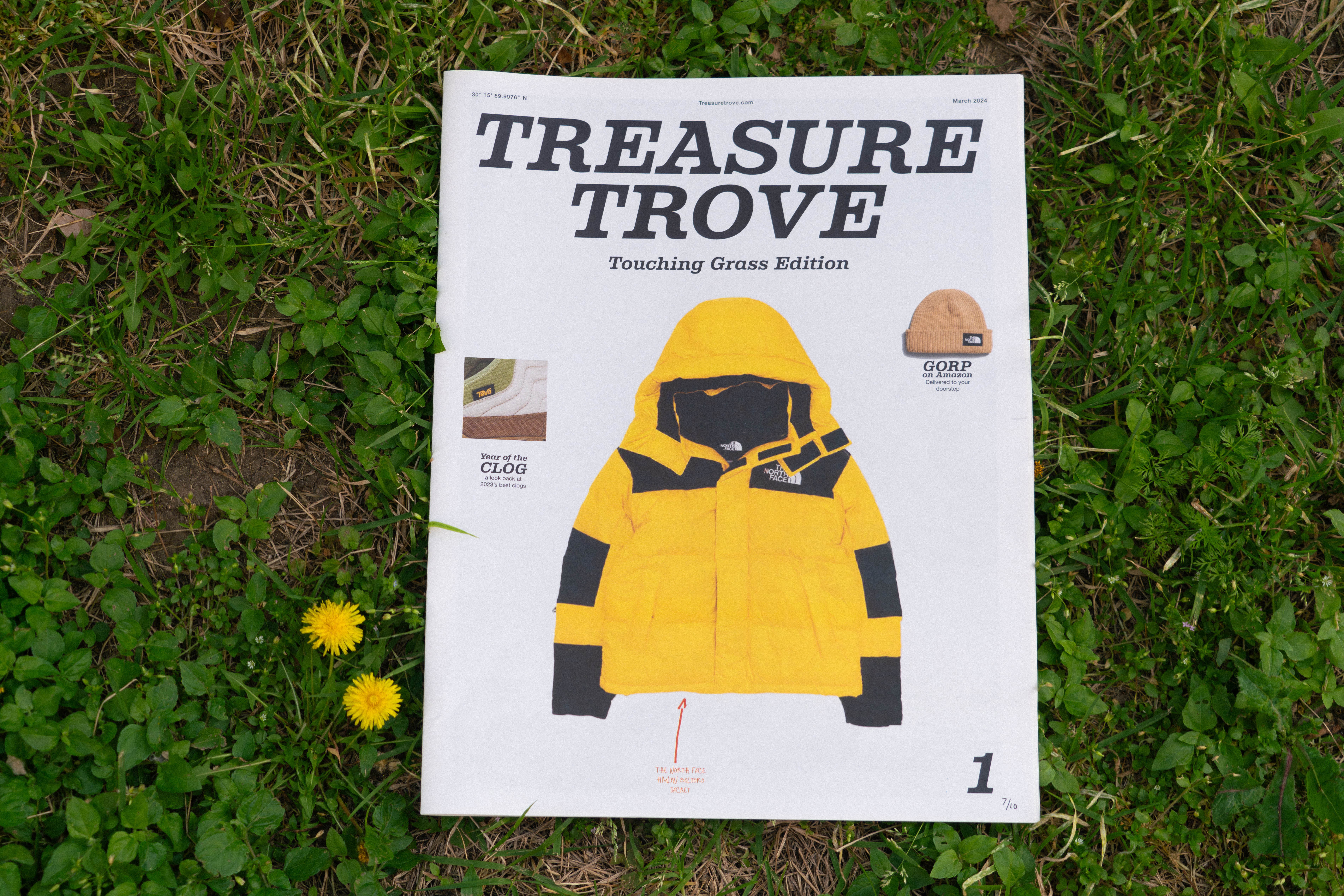
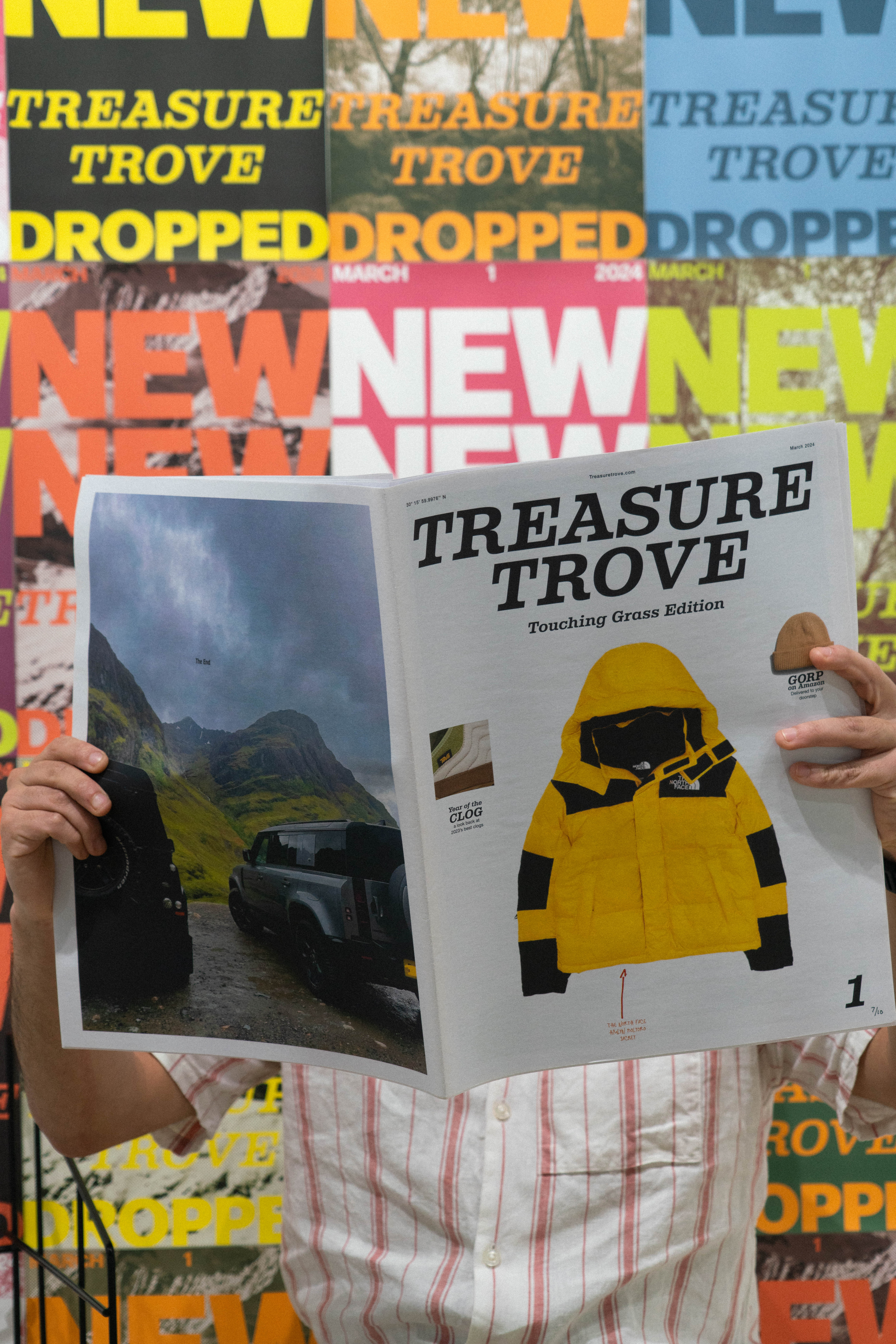
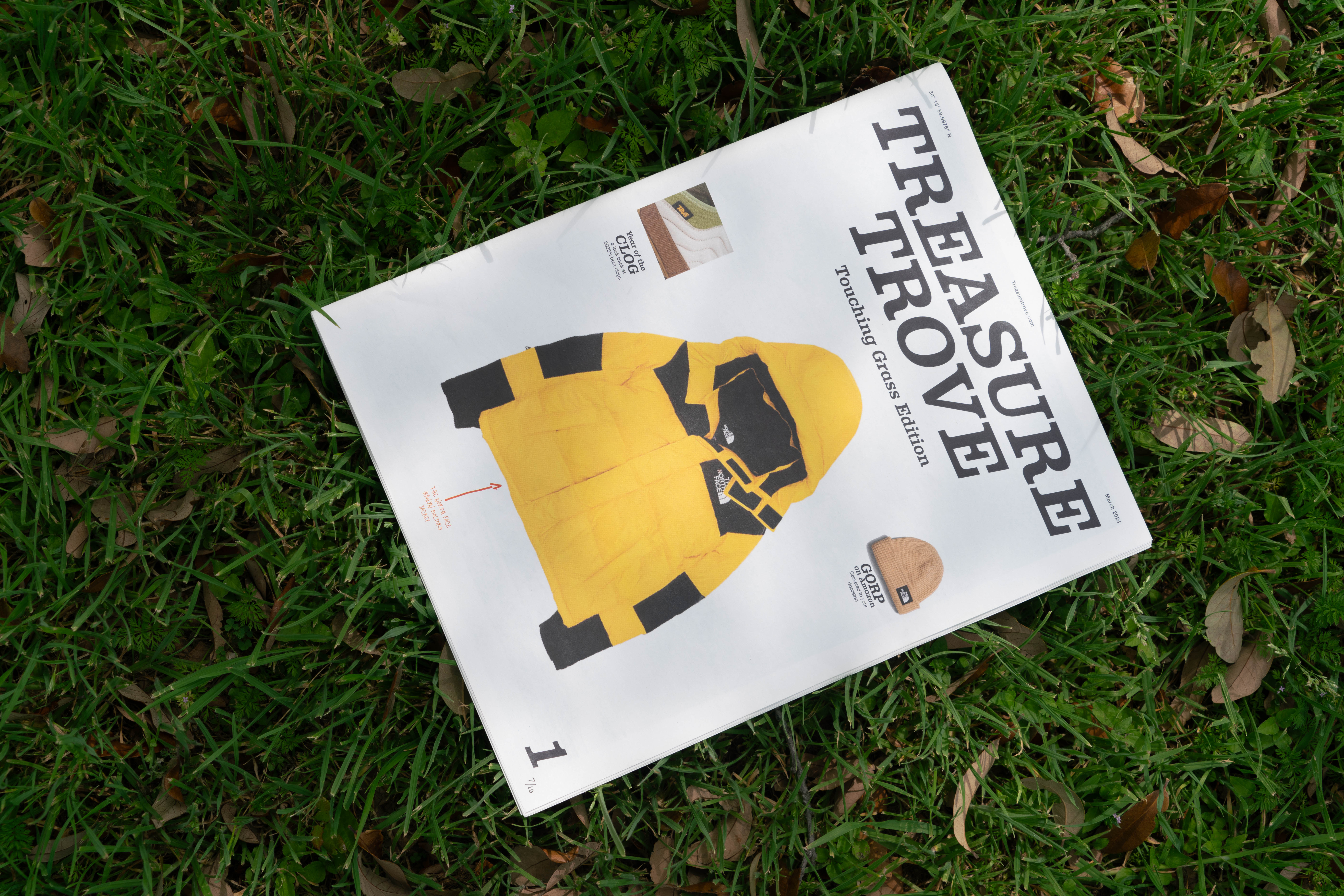
Treasure Trove is my personal take on a fashion editorial brand, taking inspiration from those found in Japan. Aiming to create a community of men (or whoever may be interested) who are interested in what they choose to put on their body, there is often a toxic stigma around men who care about fashion, and Treasure Trove challenges this stigma. The magazine would be released every three months while maintaining a social media presence between releases. Each edition would feature a new fashion style or subculture of fashion, diving deep into the details of what makes it unique and loved by that community.


Design Philosophy: Clean & Simple

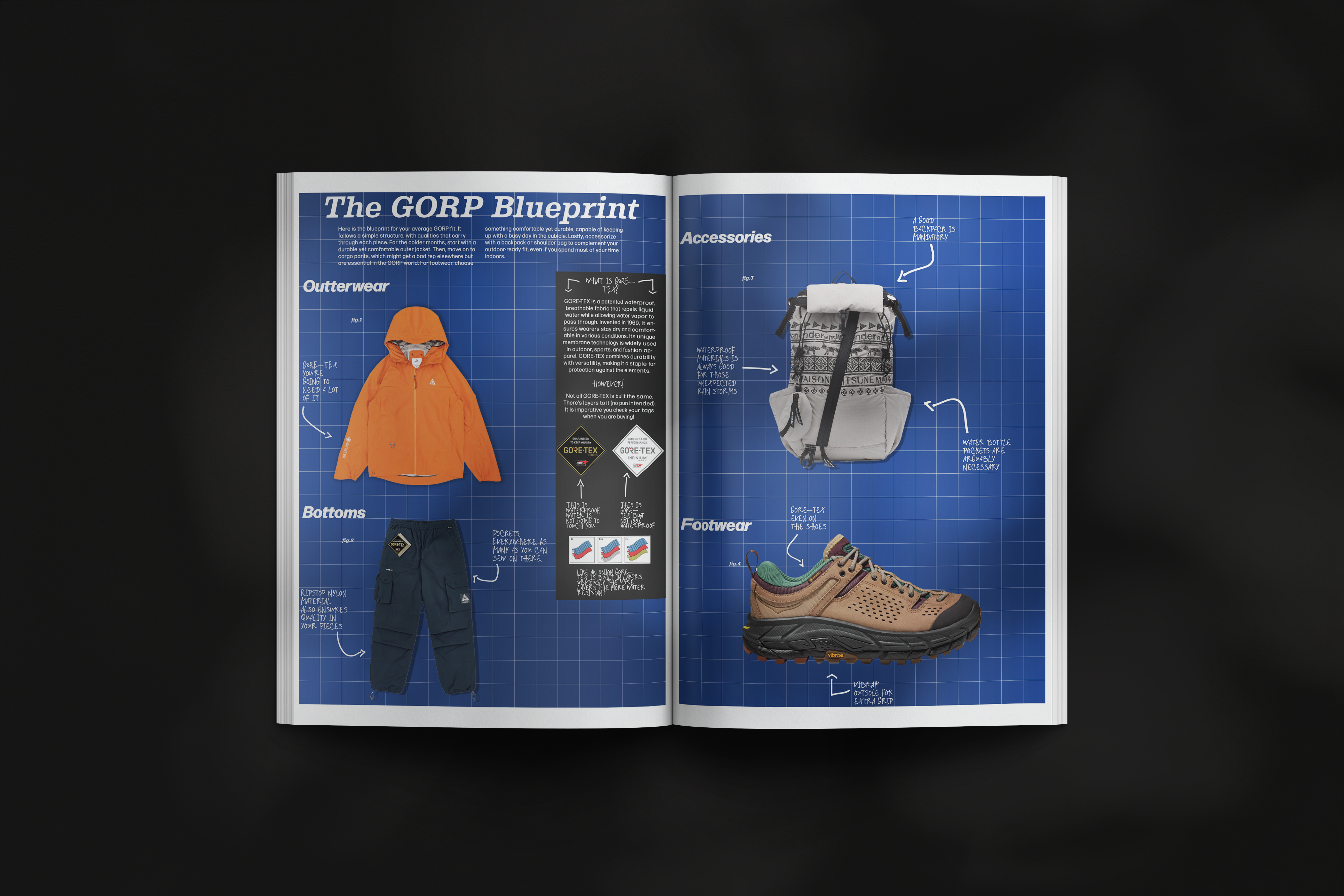
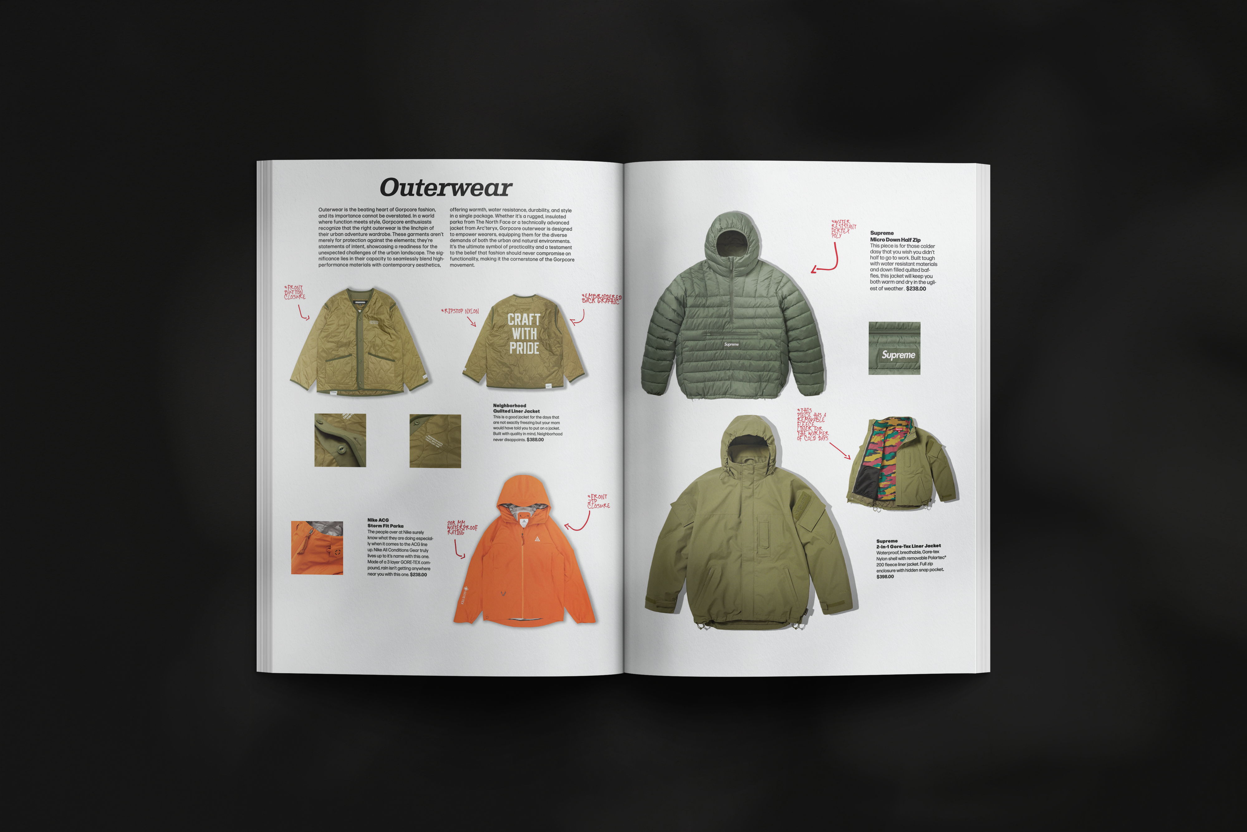
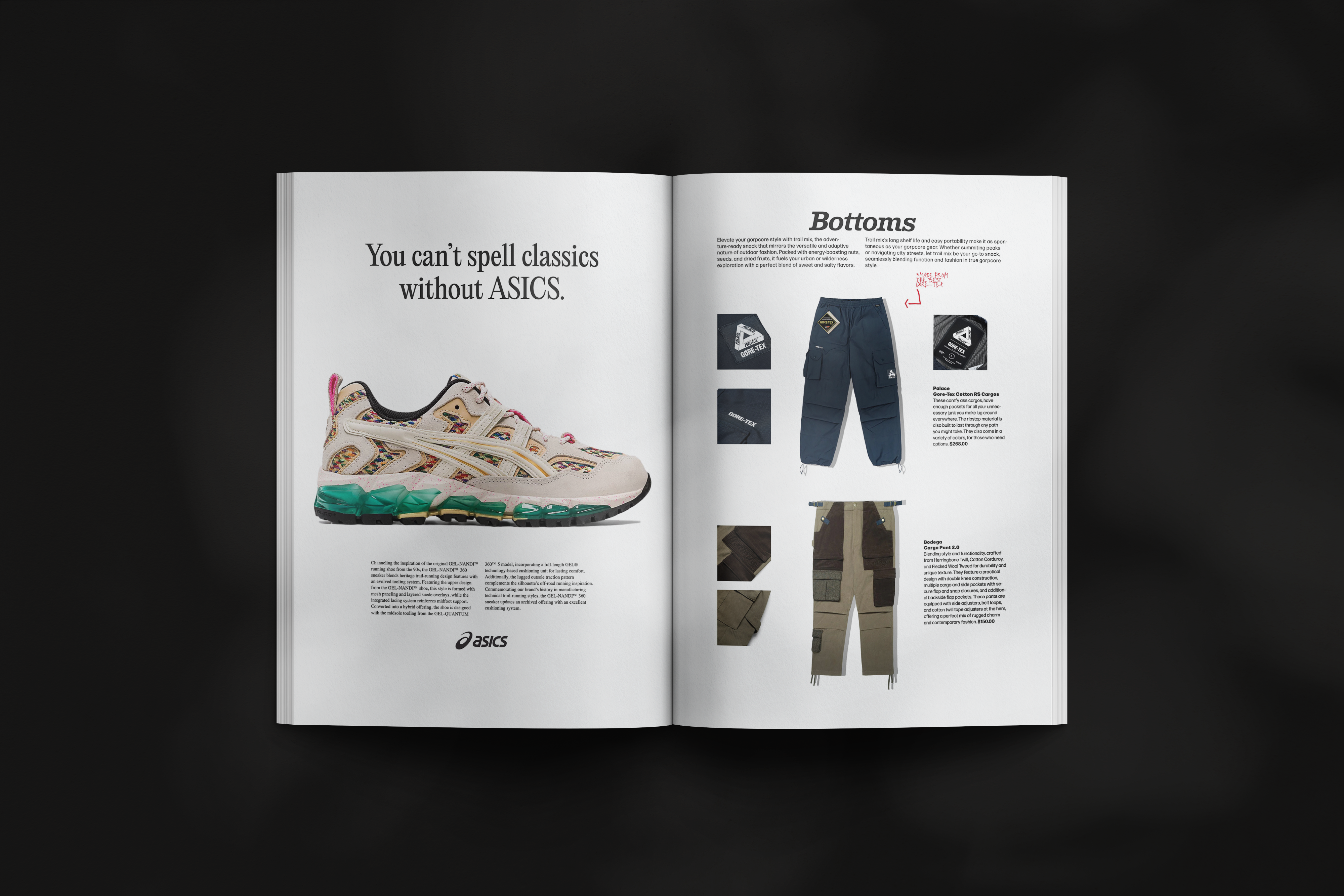
As I developed a deep love for fashion, I also found a love for Japanese lifestyle magazines like Fudge, Popeye, and Brutus. These beautifully designed magazines were nothing like what you find in the U.S. Every page was crafted with a sense of minimalism, yet I felt as though I had seen the clothing pieces in hand. Each magazine was also hyper-specific on the subject at hand. After flipping through these pictures, I felt as though I too was an expert with leather jackets. This thoroughness, stunning imagery, and clean and minimal layout is exactly what Treasure Trove aspires to be.


Target Audience

Created with a specific reader in mind, Treasure Trove aims is for the guy in your life who is super into fashion. This individual likely invests more in a rain jacket than you would on your phone. He probably went to college and is now working a well paying corporate America job. He has plenty of hobbies that include but are not limited to: Fashion (of course), music, cars, movies and nature. If he were a celebrity, he would be Tyler, the Creator.
Ideal Reader:
Nationality: American
Gender: Male
Location: City
Age : 20-45 years old
Education : College-educated
Income : $60,000-$100,000
Occupation: corporate America
Hobbies & Interests:
︎ Nature
︎ Music
︎ Movies
︎ Cars 
︎ Travel
︎ Wellness

Colors

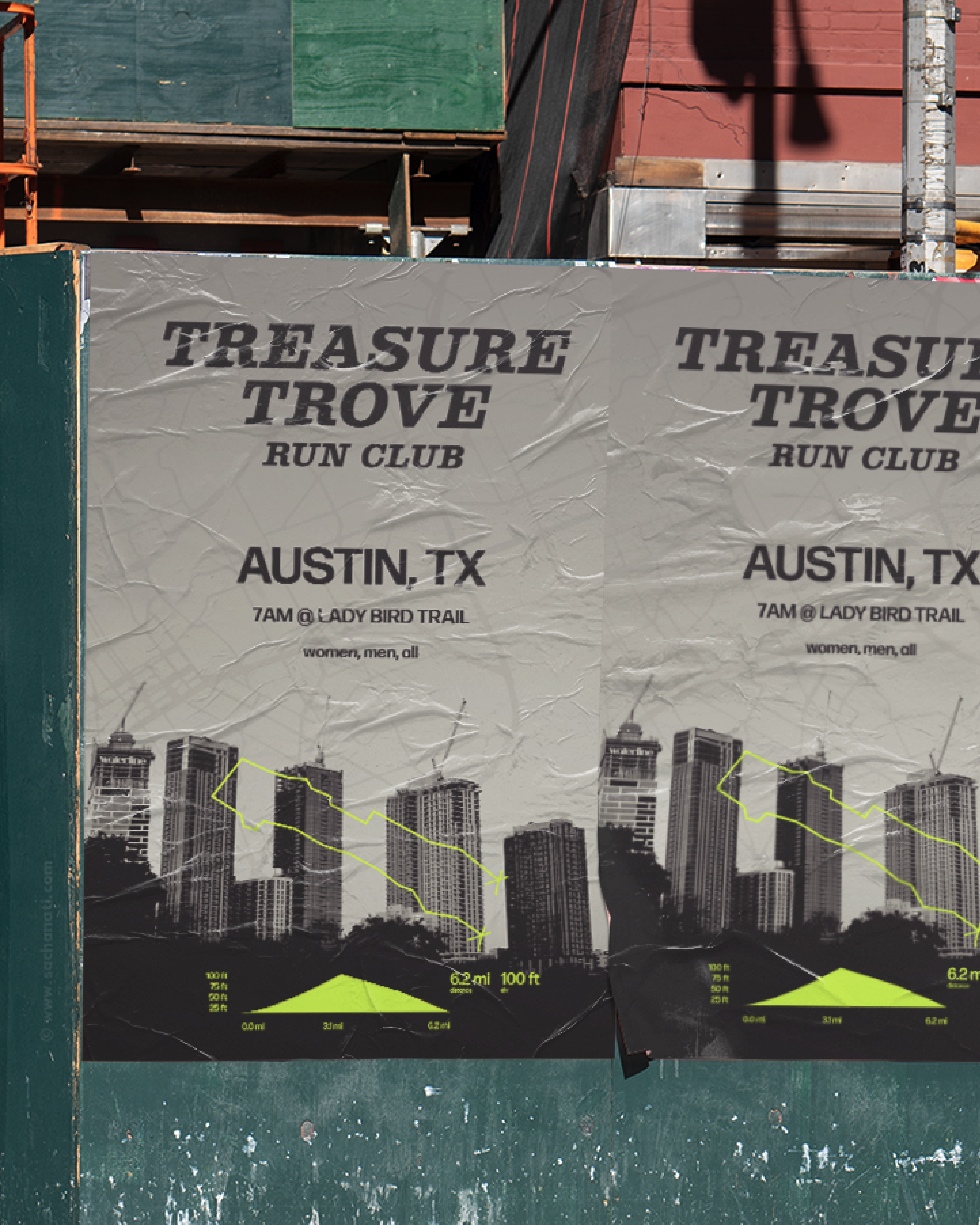
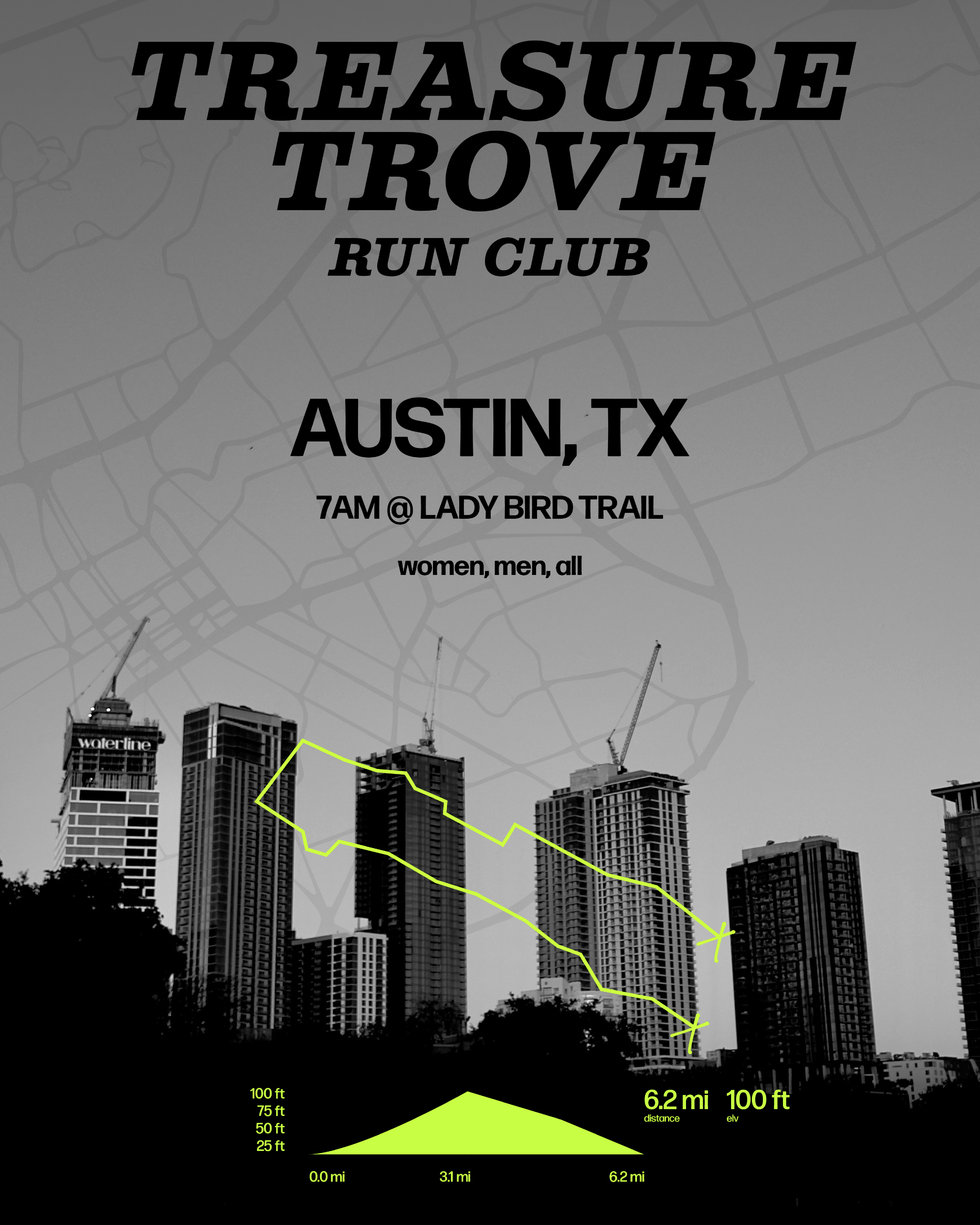
Treasure Trove was built with accessibility in mind. That being said, I went with color combinations that were highly contrasting in order to ensure that the viewer could read each of the posters that accompanied the magazine in the gallery. These colors also would also act as the base for future branding endeavors including, new editions, social media, and marketing.


Main Logo

  • Vintage-esque
  • Timeless
  • Clean
  • Simple
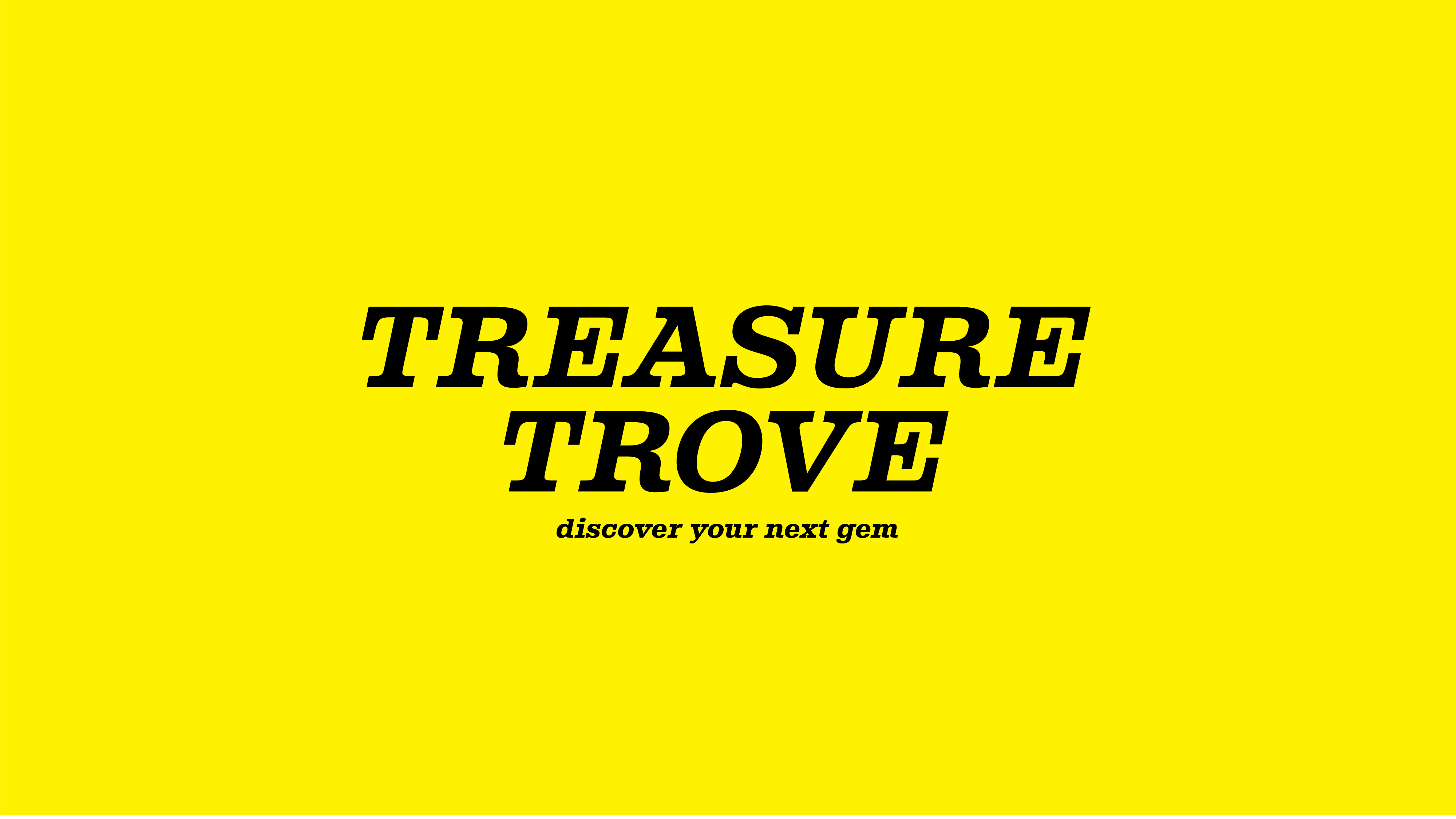
These adjectives were crucial in crafting the identity for Treasure Trove, aiming for uniqueness without being overly loud. The design was intended to be foundational, ensuring attractiveness across all issues and immediate recognition. My goal was for the logo to convey a sense of long-standing credibility, suggesting that the editorial has been established for a significant period. The slab-serif typeface Albiona, with its elegant inwardly-curved strokes, achieved this flawlessly. Representing a modern take on Clarendon, the logo is designed to propel the brand far into the future.


Alternate Logo


Brand Symbol

After working on this project for an extended period, I aimed to create something distinctly representative of Treasure Trove that fans could easily recognize. I developed the brand symbol by utilizing the space between two T's from the alternate logo, effectively using it as a building block for the symbol. I then arranged them using a grid to form the two T's of Treasure Trove.

This approach resulted in a more modern and streamlined symbol that can be easily recognized by those familiar with the publication while also standing out in the editorial scene.


What‘s Inside?

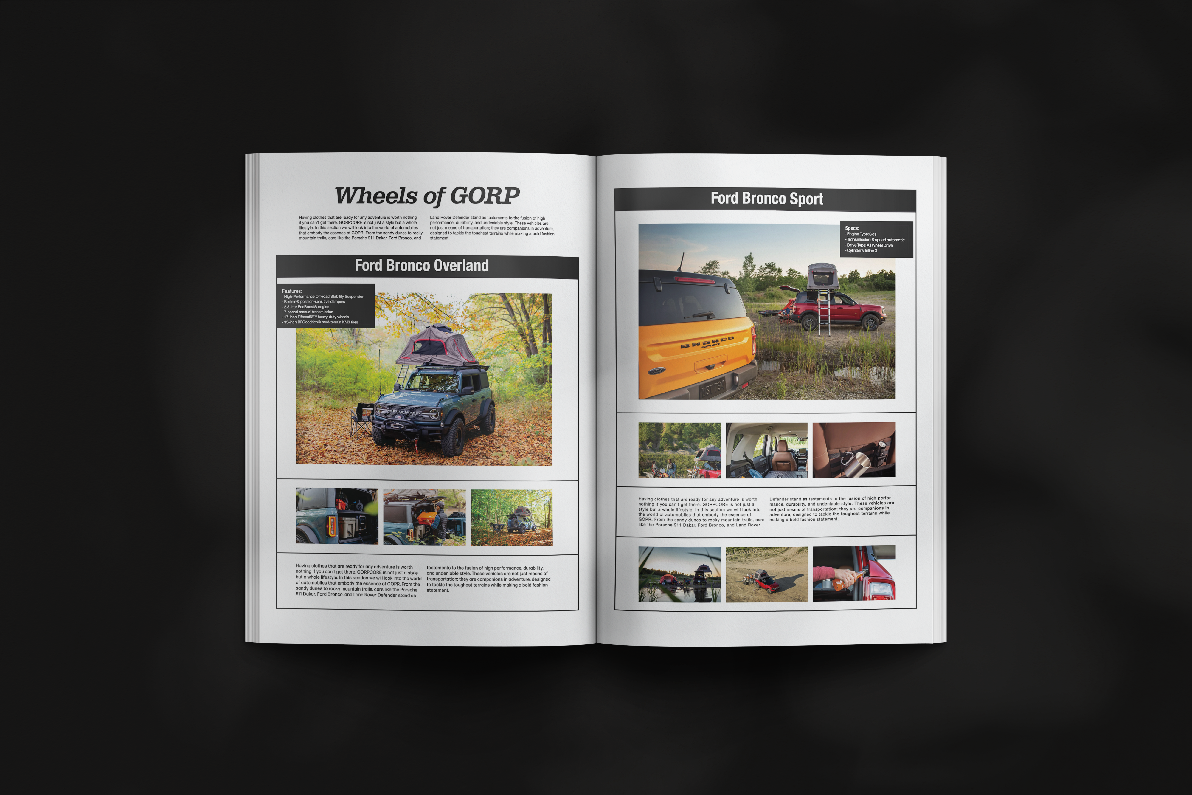
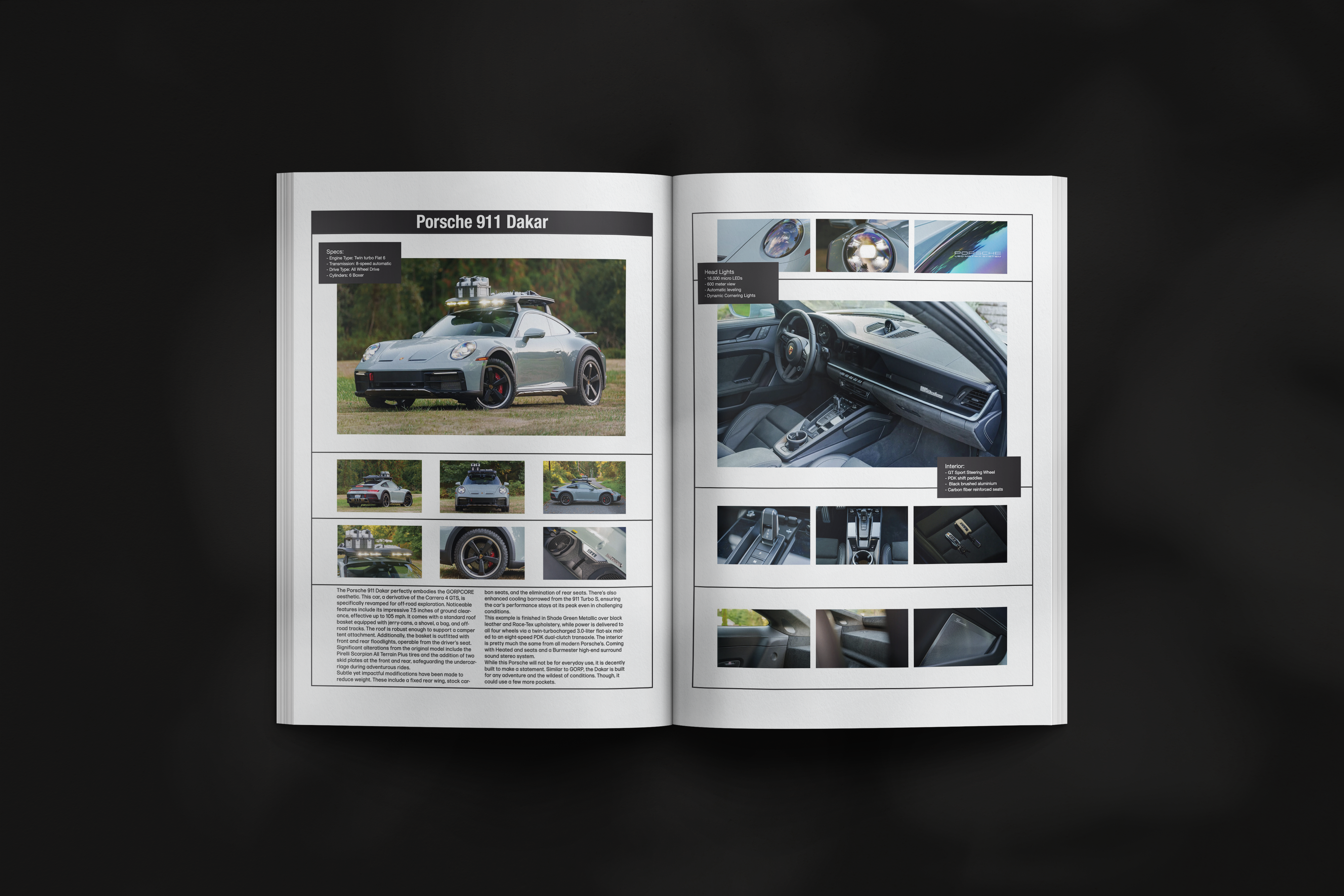
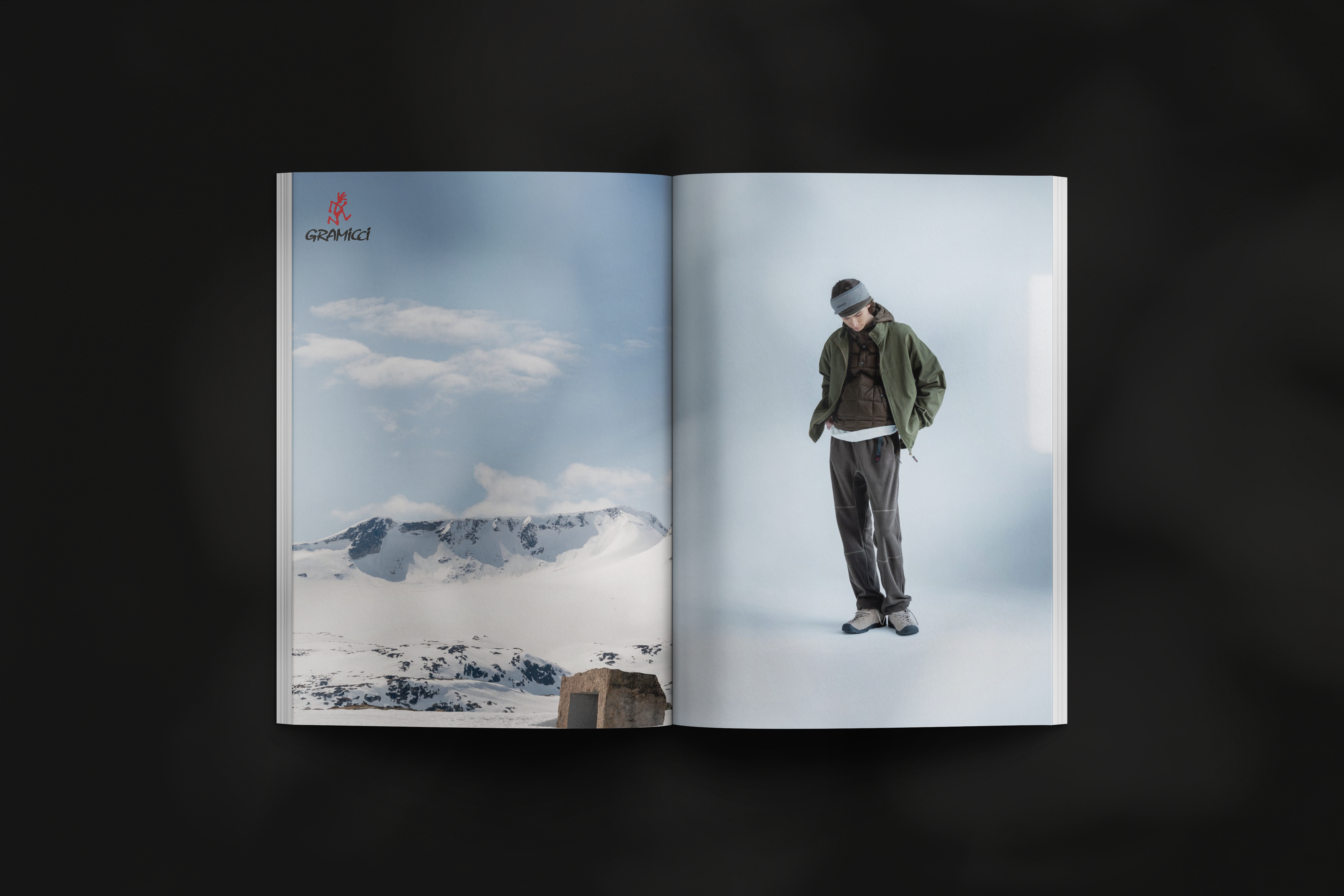
Here are some of my favorite pages from Treasure Trove: 

(some of the pages are not correct to size do to the nature of the mockup)

The Gallery

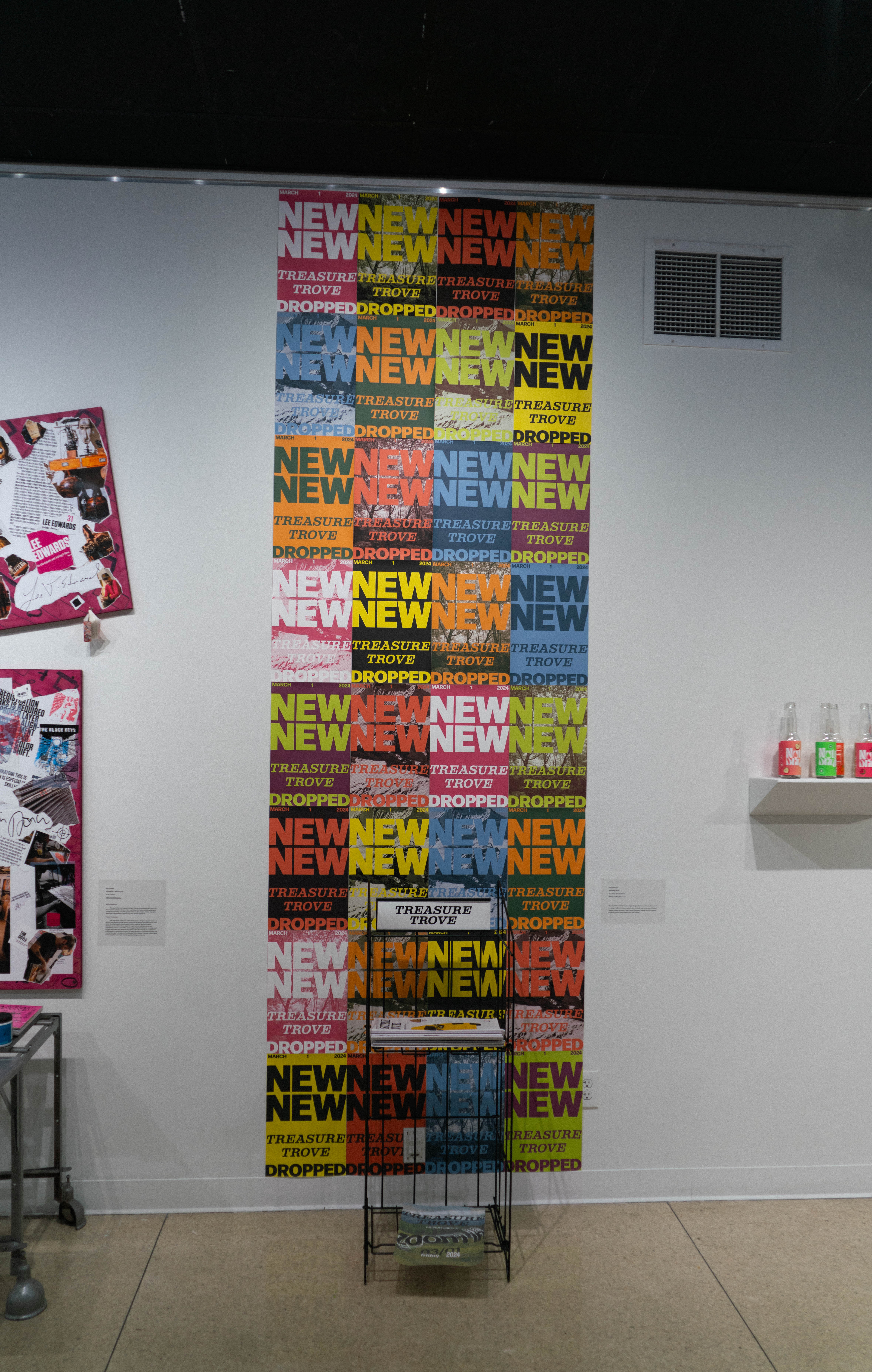
The presentation in the gallery was designed to be somewhat of a juxtaposition to the magazine itself. It was bright, loud, and large—qualities that the magazine does not possess. However, this contrast successfully attracted gallery visitors. Inspired by wheat paste posters found on city buildings, the backdrop also aimed to foster a sense of community. Similar to how individuals might take wheat paste posters, people could rip off the posters from the presentation, engaging directly with the art and taking a piece of it with them.


Merch

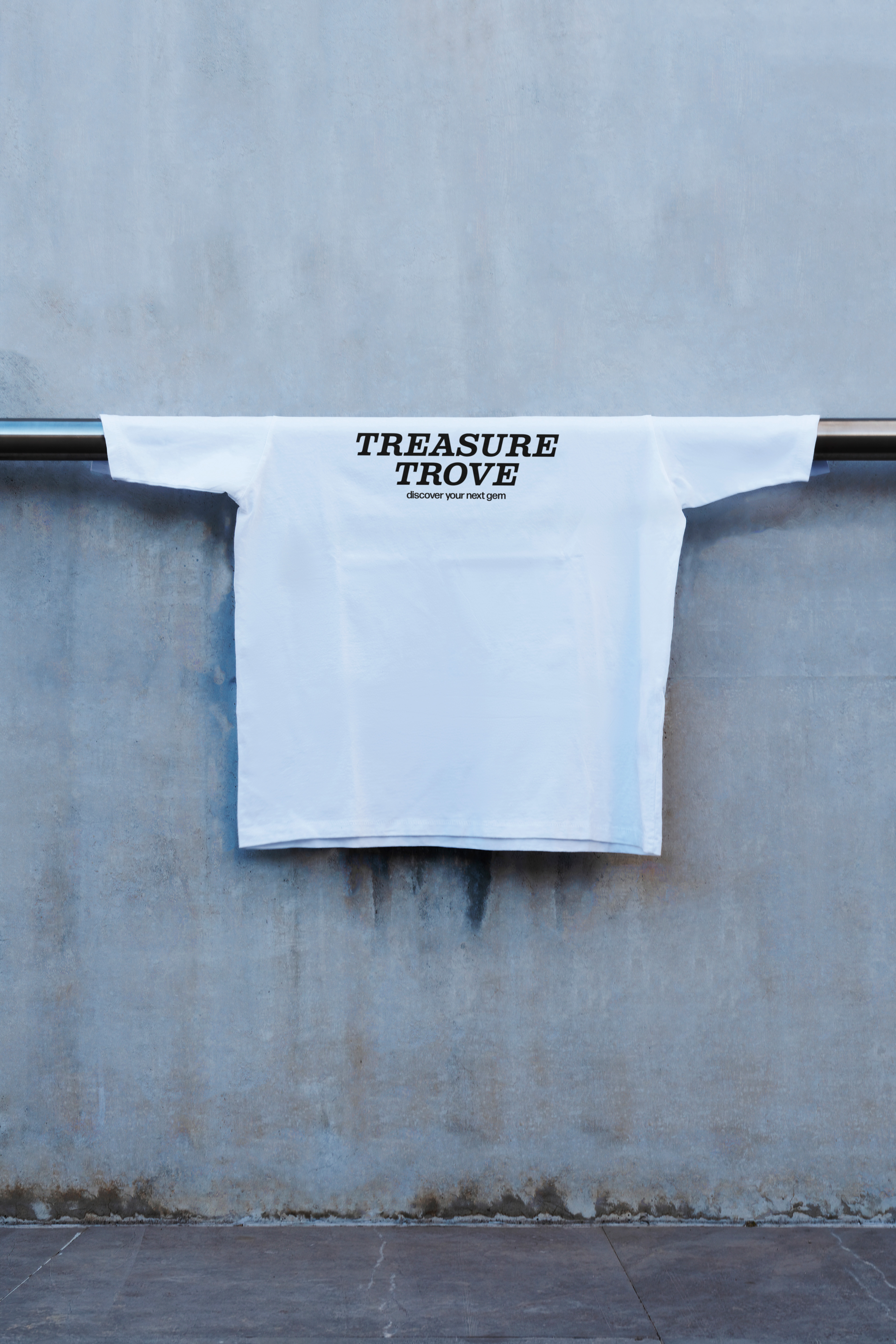
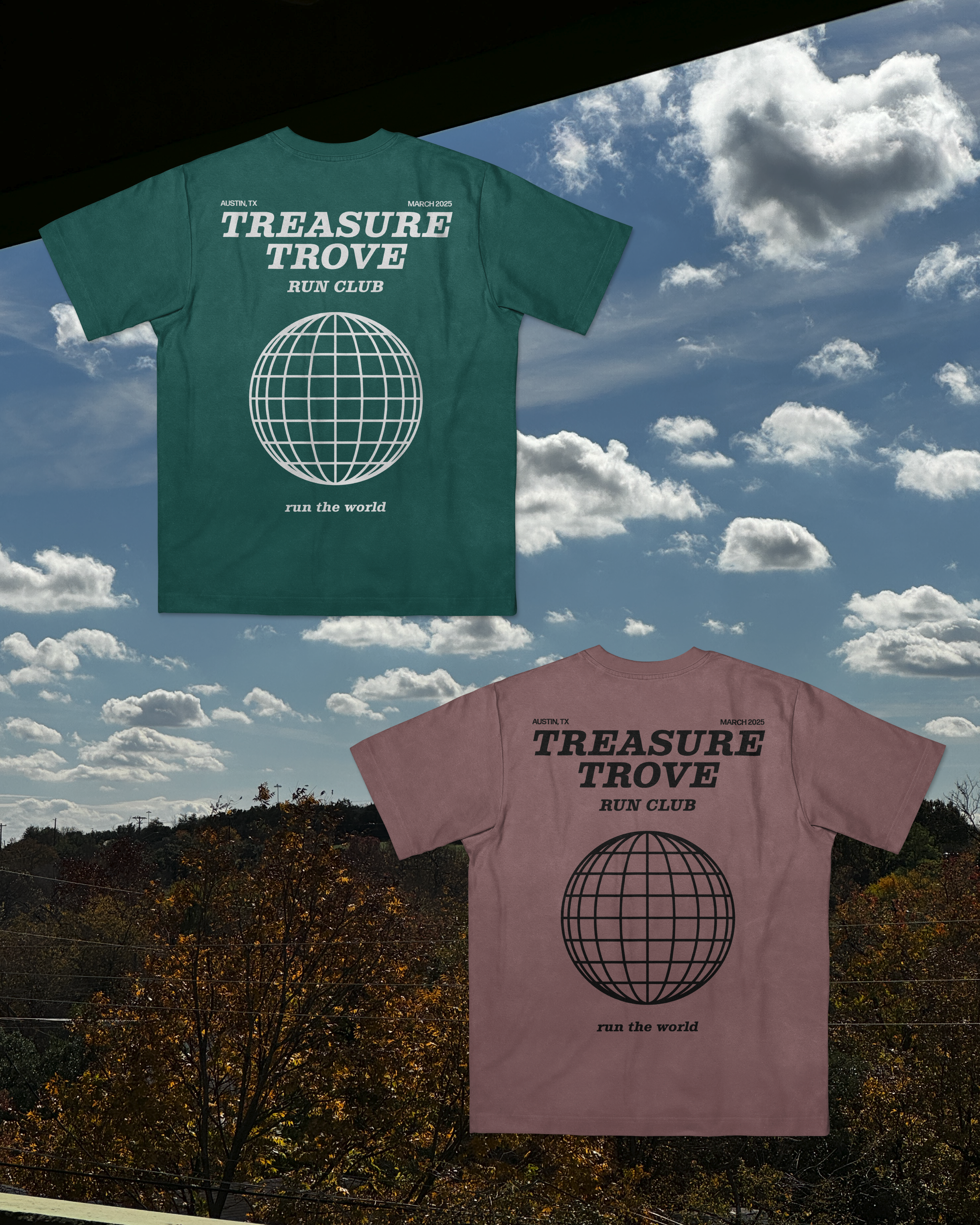
Treasure Trove is meant to be a community of people who appreciate clothing and share common interests. What better way to build a community than with merch? Keeping within the frame of today's fashion trends, I designed some pieces that were not extremely loud but carried the minimalist and understated ethos of the magazine onto fabric. Something that would encourage someone to ask, “What is that?”